🍪 THE MOST ANNOYING COOKIE BANNER EVER HACKATHON 🤬
What kind of hackathon is this?
The goal here is simple. Make THE MOST ANNOYING COOKIE BANNER you can think of.
Cookie consent banners annoy us all. So we thought, why not have some fun with them? Here are a couple examples of what that might look like:
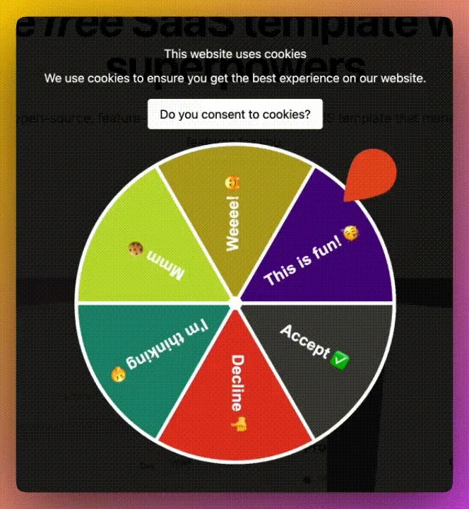
- The Cookie Consent Wheel of Fortune:
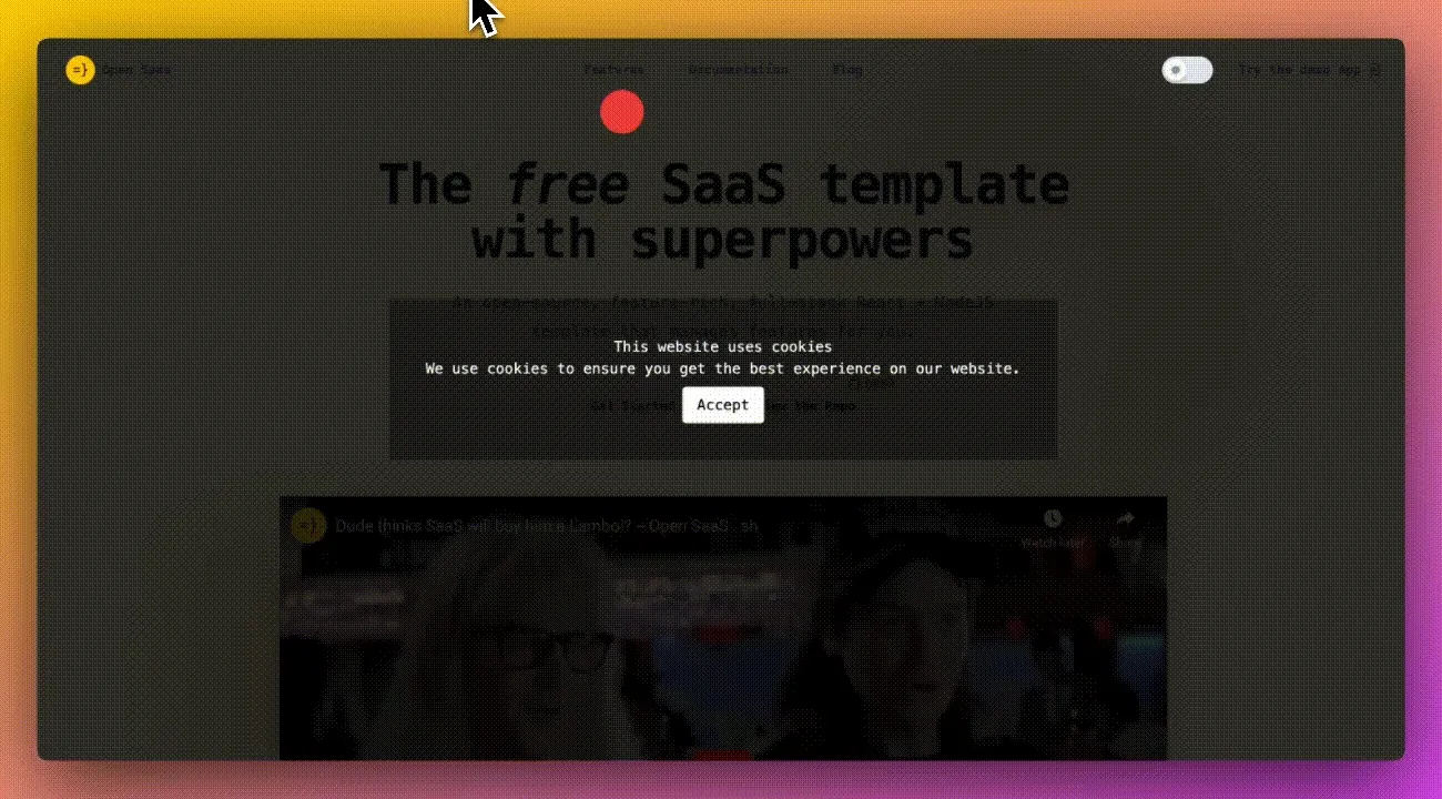
- The “Hit Enter When the Red Ball is Over the Accept Button to Consent” Banner:
Now it’s time for you to get creative. Btw, if you’re looking for some inspiration, check out these Ridiculous Volume Slider UI’s.
Prizes
2 winners will receive a nice mechanical keyboard, an additional annoying gift, as well as a shoutout on our socials.
The 2 winners will be selected by:
- The Wasp team
- Our Community (Discord & Twitter)
The community will get a chance to vote in a battle royale style elimination tournament, where two banners will go head-to-head and the winner will advance to the next round.
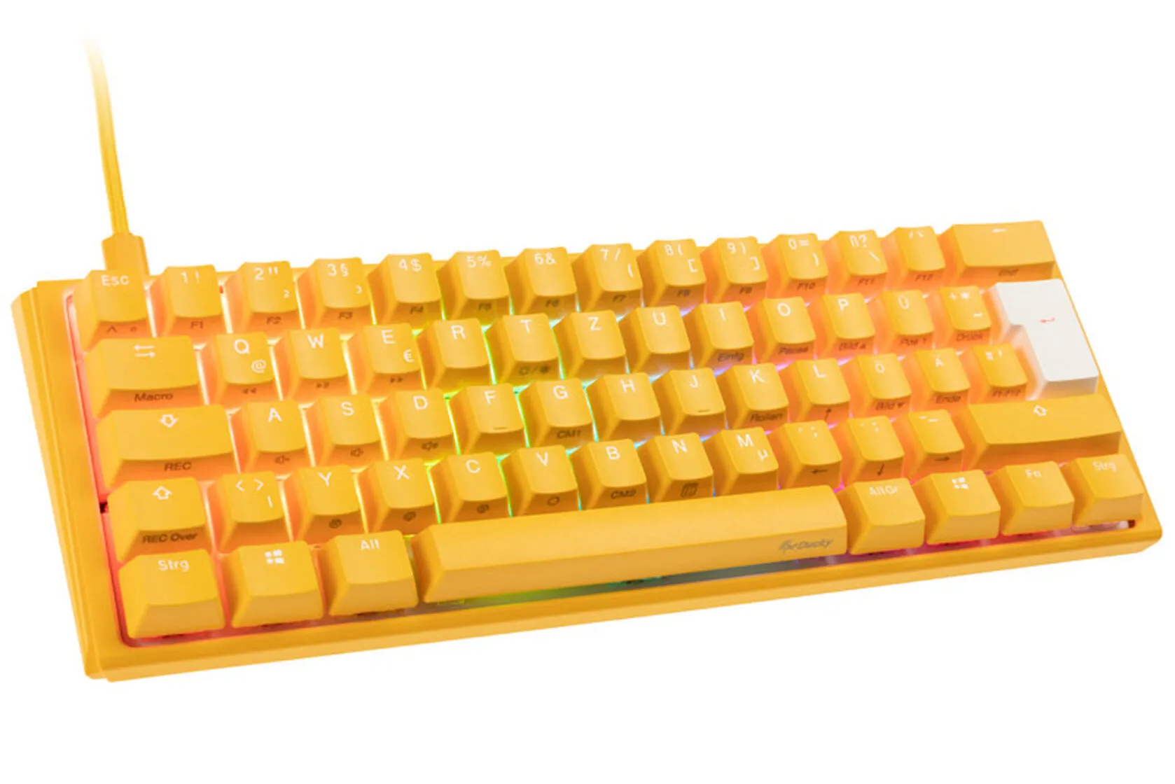
(The brand/style will depend on the winner’s location, but we’ll do our best to find one with a Wasp look and feel 😃)
How to participate
-
Fork the Annoying Cookie Banner Stackblitz Template
- If you prefer to work in your own editor, just click on the
Create a repositorybutton after you fork the template
- If you prefer to work in your own editor, just click on the
-
When finished with your banner, click on
Sharein the top left, and in theEmbedtab, clickCopy URLwith the following settings: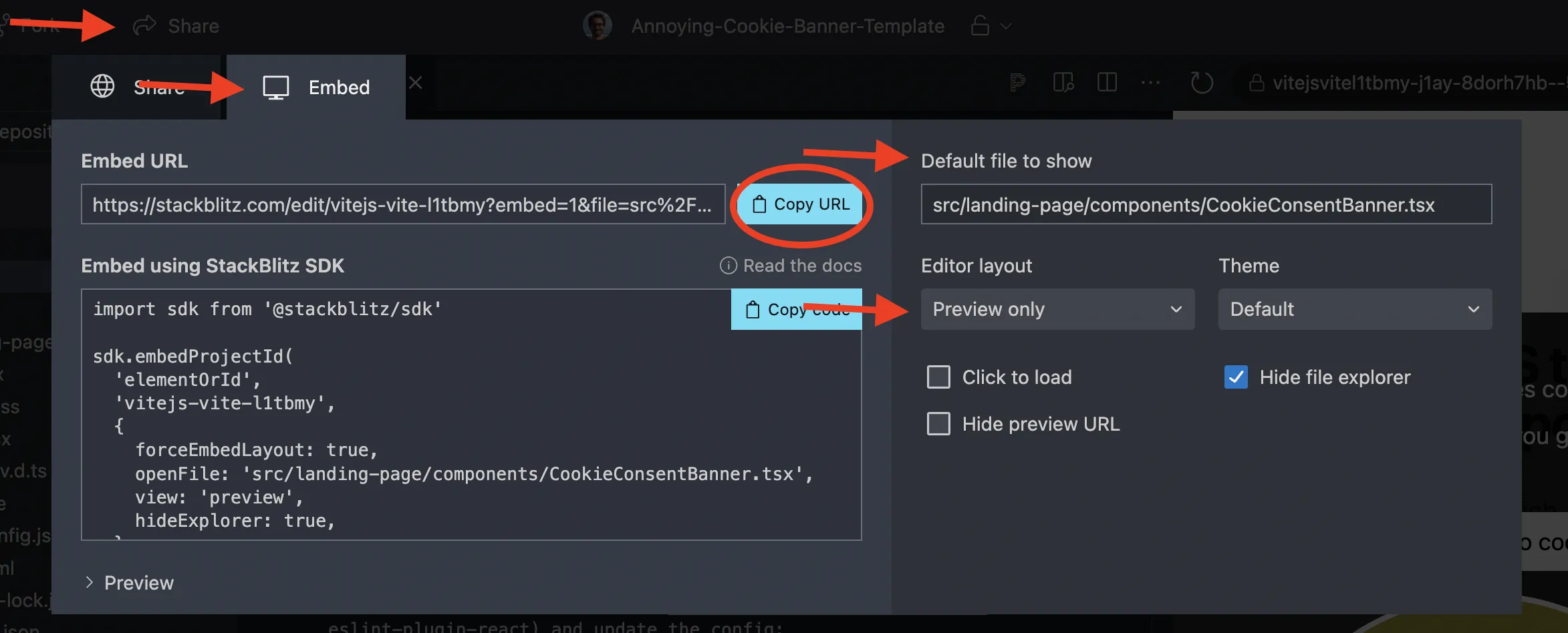
-
Next, edit the
MOST-ANNOYING-COOKIE-BANNER.mdfile on the Open SaaS repo.- Enter your GitHub username followed by the embed link you copied from Stackblitz
- Note: after you create a PR, the Wasp team will add the
ANNOYING COOKIE BANNERlabel to it.
-
Make sure you also ⭐️ star the Open Saas repository to be eligible to win!
Deadline & Results
Submit your PR before the 21st of October to be eligible to win!
Be sure to join our Discord or follow us on Twitter/X for updates and the final results!
Let’s annoy our users! 🚀
Let’s create the most annoying cookie consent banner and have some fun! This hackathon is your chance to show off your creativity and tech skills. We’re super excited to see what wild ideas you come up with.
Remember, this is all about having fun and pushing the boundaries of user interface design!
Let the annoyance games begin! 🎉
